Mastering Data Visualization with Matplotlib in Python
Data visualization is an art that helps transform raw data into valuable insights, and Python provides a powerful canvas for this artistic endeavor. At the forefront of Python’s data visualization arsenal stands Matplotlib, a versatile and widely acclaimed library. In this blog post, we embark on a journey to master the art of data visualization with Matplotlib, unraveling its core concepts and creating a variety of unique plots.
Unveiling Matplotlib
Matplotlib is the magician’s wand of data visualization in Python. Crafted by John D. Hunter in 2003 and now lovingly maintained by a dedicated community, Matplotlib empowers you to conjure captivating and informative graphics. Its high-level interface allows you to create dazzling visuals and offers a level of customization that appeals to scientists, engineers, and data scientists alike.
Here’s why Matplotlib stands out:
- Publication-Quality Plots: Matplotlib crafts publication-ready charts, putting you in command of colors, line styles, labels, and titles.
- Diverse Plot Types: You can wield Matplotlib’s magic wand to conjure a range of plot types, including line plots, scatter plots, bar plots, histograms, and more.
- Interactive or Standalone: Matplotlib accommodates your needs, whether you’re working within Jupyter notebooks or crafting standalone scripts for static images.
- Seamless NumPy Integration: Matplotlib and NumPy join forces seamlessly, facilitating the visualization of data stored in NumPy arrays.
Now that you’ve glimpsed the power of Matplotlib, let’s explore the basics of creating enchanting plots.
Matplotlib Examples
1. Line Plot: A simple line plot showing a sine wave.
import matplotlib.pyplot as plt
import numpy as np
x = np.linspace(0, 2 * np.pi, 100)
y = np.sin(x)
plt.plot(x, y)
plt.xlabel('X-axis')
plt.ylabel('Y-axis')
plt.title('Sine Wave')
plt.show()
2. Scatter Plot: A scatter plot with random data points.
import matplotlib.pyplot as plt
import numpy as np
x = np.random.rand(50)
y = np.random.rand(50)
plt.scatter(x, y)
plt.xlabel('X-axis')
plt.ylabel('Y-axis')
plt.title('Scatter Plot')
plt.show()
3. Bar Plot: A bar plot displaying data with categories.
import matplotlib.pyplot as plt
categories = ['Category A', 'Category B', 'Category C']
values = [25, 40, 30]
plt.bar(categories, values)
plt.xlabel('Categories')
plt.ylabel('Values')
plt.title('Bar Plot')
plt.show()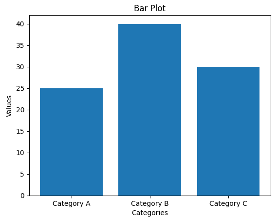
4. Histogram: A histogram showing the distribution of a dataset.
import matplotlib.pyplot as plt
import numpy as np
data = np.random.randn(1000)  # Generating random data
plt.hist(data, bins=20, color='skyblue', edgecolor='black')
plt.xlabel('Values')
plt.ylabel('Frequency')
plt.title('Histogram')
plt.show()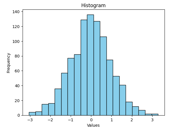
5. Pie Chart: A pie chart displaying the distribution of a dataset.
import matplotlib.pyplot as plt
labels = 'A', 'B', 'C', 'D'
sizes = [15, 30, 45, 10]
colors = ['gold', 'yellowgreen', 'lightcoral', 'lightskyblue']
plt.pie(sizes, labels=labels, colors=colors, autopct='%1.1f%%', shadow=True)
plt.axis('equal')  # Equal aspect ratio ensures a circular pie
plt.title('Pie Chart')
plt.show()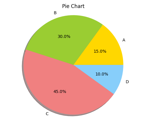
6. Box Plot: A box plot for visualizing the distribution of a dataset.
import matplotlib.pyplot as plt
import numpy as np
data = [np.random.normal(0, std, 100) for std in range(1, 4)]
plt.boxplot(data, vert=True, patch_artist=True)
plt.xlabel('Data Sets')
plt.ylabel('Values')
plt.title('Box Plot')
plt.show()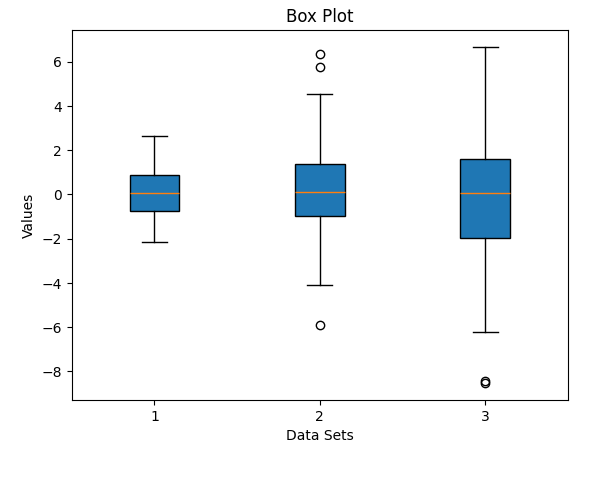
7. Heatmap: A heatmap to visualize a matrix of data.
import matplotlib.pyplot as plt
import numpy as np
data = np.random.rand(10, 10)
plt.imshow(data, cmap='viridis')
plt.colorbar()
plt.title('Heatmap')
plt.show()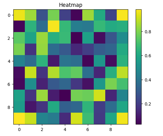
These are just a few examples of what you can do with Matplotlib. The library provides extensive customization options, and you can create more complex and informative visualizations by combining these basic plot types and using Matplotlib’s advanced features. Explore the Matplotlib documentation and tutorials for further guidance and inspiration.
The Dataset
To create meaningful visualizations, you’ll need a dataset. Below, I’ll provide an example of how to load a dataset using the popular Python library pandas. In this example, I'll use a sample dataset called the "Iris dataset," which is often used for data visualization and machine learning purposes. You can replace this with your own dataset as needed.
First, you need to install the pandas library if you haven't already:
pip install pandasNow, here’s how to load and use the Iris dataset:
import pandas as pd
# Load the Iris dataset
url = "https://raw.githubusercontent.com/uiuc-cse/data-fa14/gh-pages/data/iris.csv"
data = pd.read_csv(url)
# Display the first few rows of the dataset to get an overview
print(data.head())
# Now, you can use the data for plotting
The Iris dataset is a small dataset that contains information about different species of iris flowers, including sepal and petal measurements. It’s often used to demonstrate data visualization techniques and machine learning tasks.
You can replace the url variable with the path to your own dataset or load data from a local file, depending on your specific dataset and use case.
Once you have your dataset loaded using pandas, you can use Matplotlib to create various types of plots and visualizations as shown in the previous examples. For example, you can create histograms of various features, scatter plots to compare features, or box plots to visualize the distribution of data within different categories or classes within your dataset.
Loading Matplotlib
Matplotlib is a Python library for data visualization, and you don’t need to “load” it in the traditional sense as you would with a dataset. Instead, you need to import Matplotlib in your Python script or Jupyter Notebook to use its functionality.
Here’s how you import Matplotlib:
import matplotlib.pyplot as pltYou typically import it using the alias plt for convenience. This allows you to call Matplotlib functions using plt.<function_name>, making your code cleaner and more readable.
Here’s a simple example of how to create a basic plot with Matplotlib:
import matplotlib.pyplot as plt
import numpy as np
# Sample data
x = np.linspace(0, 10, 100)
y = np.sin(x)
# Create a simple line plot
plt.plot(x, y)
# Add labels and a title
plt.xlabel('X-axis')
plt.ylabel('Y-axis')
plt.title('Simple Matplotlib Plot')
# Display the plot
plt.show()
In this example, we imported Matplotlib as plt, created a basic line plot, added labels and a title, and finally displayed the plot using plt.show().
Drawing Line Plots
To draw a line plot using the provided “Iris dataset,” we first need to load the data and then choose two continuous variables to plot. Since the Iris dataset typically consists of categorical data for the species and numerical data for sepal and petal measurements, let’s choose two numerical variables to create a line plot.
In this example, we’ll plot a line graph for the sepal length of a specific species (let’s choose “setosa”) over the range of data points. To do this, we’ll need to filter the dataset for “setosa” and select the sepal length values.
Here’s how you can draw a line plot for sepal length of the “setosa” species from the Iris dataset:
import matplotlib.pyplot as plt
import pandas as pd

# Load the Iris dataset (assuming you have the dataset available)
url = "https://raw.githubusercontent.com/uiuc-cse/data-fa14/gh-pages/data/iris.csv"
iris_data = pd.read_csv(url)

# Filter the dataset for the "setosa" species
setosa_data = iris_data[iris_data['species'] == 'setosa']

# Extract sepal length values and create an array for the x-axis
x = setosa_data.index  # Use the index as the x-axis values
sepal_length = setosa_data['sepal_length']

# Create a line plot for sepal length
plt.plot(x, sepal_length, label='Sepal Length', color='blue', linestyle='-', linewidth=2)

# Add labels and a title
plt.xlabel('Data Points')
plt.ylabel('Sepal Length (cm)')
plt.title('Sepal Length of Setosa Iris')

# Display the plot
plt.show()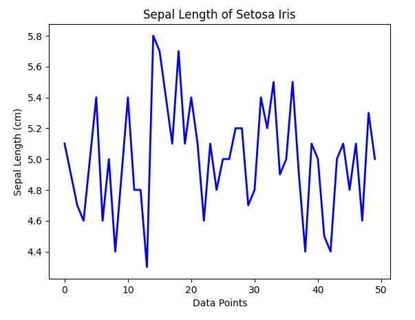
Line Plots with Multiple Lines and Adding a Legend
Creating line plots with multiple lines is a common task in data visualization when you want to compare multiple datasets or display multiple variables in a single plot. In this example, we’ll create a line plot with multiple lines to compare the sepal length and sepal width of the “setosa” and “versicolor” species from the Iris dataset.
Here’s how you can draw a line plot with multiple lines:
import matplotlib.pyplot as plt
import pandas as pd

# Load the Iris dataset
url = "https://raw.githubusercontent.com/uiuc-cse/data-fa14/gh-pages/data/iris.csv"
iris_data = pd.read_csv(url)

# Filter the dataset for the "setosa" and "versicolor" species
setosa_data = iris_data[iris_data['species'] == 'setosa']
versicolor_data = iris_data[iris_data['species'] == 'versicolor']

# Extract sepal length and sepal width values
x = setosa_data.index  # Use the index as the x-axis values
sepal_length_setosa = setosa_data['sepal_length']
sepal_length_versicolor = versicolor_data['sepal_length']
sepal_width_setosa = setosa_data['sepal_width']
sepal_width_versicolor = versicolor_data['sepal_width']

# Create a line plot for sepal length
plt.plot(x, sepal_length_setosa, label='Setosa Sepal Length', color='blue', linestyle='-', linewidth=2)
plt.plot(x, sepal_length_versicolor, label='Versicolor Sepal Length', color='green', linestyle='-', linewidth=2)

# Create a line plot for sepal width
plt.plot(x, sepal_width_setosa, label='Setosa Sepal Width', color='red', linestyle='-', linewidth=2)
plt.plot(x, sepal_width_versicolor, label='Versicolor Sepal Width', color='purple', linestyle='-', linewidth=2)

# Add labels and a title
plt.xlabel('Data Points')
plt.ylabel('Values (cm)')
plt.title('Sepal Length and Sepal Width Comparison')

# Add a legend to distinguish lines
plt.legend()

# Display the plot
plt.show()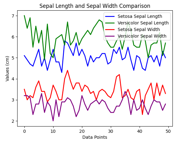
Drawing Bar Plots — Vertical Bar Plots
Creating bar plots is a great way to visualize data when you want to compare different categories or groups. In this example, we’ll create a bar plot to compare the average sepal length of different species in the Iris dataset.
import matplotlib.pyplot as plt
import pandas as pd

# Load the Iris dataset
url = "https://raw.githubusercontent.com/uiuc-cse/data-fa14/gh-pages/data/iris.csv"
iris_data = pd.read_csv(url)

# Calculate the average sepal length for each species
species = iris_data['species'].unique()
sepal_length_means = [iris_data[iris_data['species'] == spec]['sepal_length'].mean() for spec in species]

# Create a bar plot
plt.bar(species, sepal_length_means, color=['blue', 'green', 'red'])

# Add labels and a title
plt.xlabel('Species')
plt.ylabel('Average Sepal Length (cm)')
plt.title('Average Sepal Length by Species')

# Display the plot
plt.show()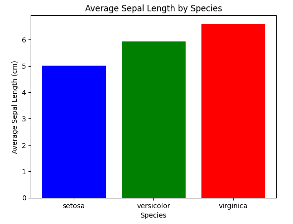
Horizontal Bar Plots
Horizontal bar plots are a useful way to display data when you want to compare categories or groups with horizontal bars.
import matplotlib.pyplot as plt
import pandas as pd

# Load the Iris dataset
url = "https://raw.githubusercontent.com/uiuc-cse/data-fa14/gh-pages/data/iris.csv"
iris_data = pd.read_csv(url)

# Calculate the average sepal length for each species
species = iris_data['species'].unique()
sepal_length_means = [iris_data[iris_data['species'] == spec]['sepal_length'].mean() for spec in species]

# Create a horizontal bar plot
plt.barh(species, sepal_length_means, color=['blue', 'green', 'red'])

# Add labels and a title
plt.xlabel('Average Sepal Length (cm)')
plt.ylabel('Species')
plt.title('Average Sepal Length by Species')

# Display the plot
plt.show()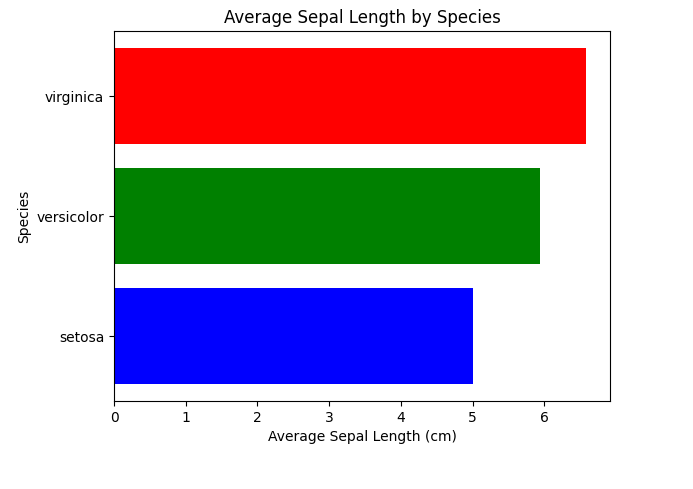
Drawing Scatter Plots
Scatter plots are an effective way to visualize the relationship between two numerical variables
import matplotlib.pyplot as plt
import pandas as pd

# Load the Iris dataset
url = "https://raw.githubusercontent.com/uiuc-cse/data-fa14/gh-pages/data/iris.csv"
iris_data = pd.read_csv(url)

# Define colors and markers for each species
colors = {'setosa': 'red', 'versicolor': 'green', 'virginica': 'blue'}
markers = {'setosa': 'o', 'versicolor': 's', 'virginica': '^'}

# Create a scatter plot for sepal length vs. sepal width
for species, color in colors.items():
    species_data = iris_data[iris_data['species'] == species]
    plt.scatter(
        species_data['sepal_length'],
        species_data['sepal_width'],
        label=species,
        color=color,
        marker=markers[species],
    )

# Add labels and a title
plt.xlabel('Sepal Length (cm)')
plt.ylabel('Sepal Width (cm)')
plt.title('Sepal Length vs. Sepal Width by Species')

# Add a legend to distinguish species
plt.legend()

# Display the plot
plt.show()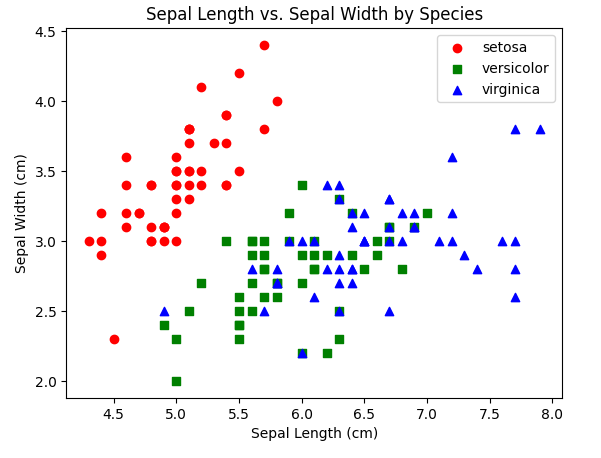
Scatter Plots with a Trend Line
Creating scatter plots with a trend line (regression line) is useful for visualizing the relationship between two numerical variables and identifying any patterns or trends. In this example, we’ll create a scatter plot with a linear trend line using Matplotlib and NumPy to fit the line to the data. We’ll use the Iris dataset to compare sepal length and sepal width for a specific species (e.g., “setosa”).
import matplotlib.pyplot as plt
import pandas as pd
import numpy as np

# Load the Iris dataset
url = "https://raw.githubusercontent.com/uiuc-cse/data-fa14/gh-pages/data/iris.csv"
iris_data = pd.read_csv(url)

# Filter the dataset for a specific species, e.g., "setosa"
species_data = iris_data[iris_data['species'] == 'setosa']

# Extract sepal length and sepal width values
sepal_length = species_data['sepal_length']
sepal_width = species_data['sepal_width']

# Create a scatter plot
plt.scatter(sepal_length, sepal_width, color='blue', label='Setosa Data', marker='o')

# Add labels and a title
plt.xlabel('Sepal Length (cm)')
plt.ylabel('Sepal Width (cm)')
plt.title('Scatter Plot with Trend Line for Setosa Species')

# Fit a linear trend line using NumPy's polyfit
m, b = np.polyfit(sepal_length, sepal_width, 1)
plt.plot(sepal_length, m * sepal_length + b, color='red', label=f'Trend Line (y = {m:.2f}x + {b:.2f})')

# Add a legend to distinguish data and trend line
plt.legend()

# Display the plot
plt.show()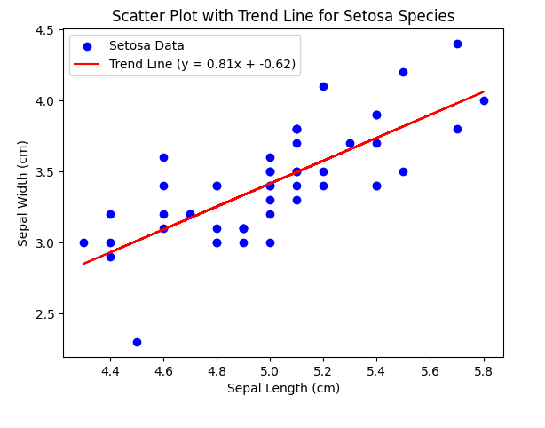
Saving Plots
Saving your plots is important for sharing and using them in documents or presentations. You can save your Matplotlib plots in various formats, such as PNG, JPEG, PDF, or SVG. Here’s how to save a scatter plot with a trend line to a PNG file:
import matplotlib.pyplot as plt
import pandas as pd
import numpy as np

# Load the Iris dataset
url = "https://raw.githubusercontent.com/uiuc-cse/data-fa14/gh-pages/data/iris.csv"
iris_data = pd.read_csv(url)

# Filter the dataset for a specific species, e.g., "setosa"
species_data = iris_data[iris_data['species'] == 'setosa']

# Extract sepal length and sepal width values
sepal_length = species_data['sepal_length']
sepal_width = species_data['sepal_width']

# Create a scatter plot
plt.scatter(sepal_length, sepal_width, color='blue', label='Setosa Data', marker='o')

# Add labels and a title
plt.xlabel('Sepal Length (cm)')
plt.ylabel('Sepal Width (cm)')
plt.title('Scatter Plot with Trend Line for Setosa Species')

# Fit a linear trend line using NumPy's polyfit
m, b = np.polyfit(sepal_length, sepal_width, 1)
plt.plot(sepal_length, m * sepal_length + b, color='red', label=f'Trend Line (y = {m:.2f}x + {b:.2f})')

# Add a legend to distinguish data and trend line
plt.legend()

# Save the plot to a PNG file
plt.savefig('scatter_plot_with_trend_line.png', format='png', dpi=300)

# Display the plot
plt.show()
Conclusion
Matplotlib is a powerful and flexible library for creating data visualizations in Python. In this blog post, you’ve learned the basics of getting started with Matplotlib, creating line plots, customizing your plots, and creating different types of visualizations. As you continue your data analysis or scientific research journey in Python, Matplotlib will be an invaluable tool for turning your data into informative and visually appealing plots and charts. Remember to explore the official Matplotlib documentation for more advanced features and customization options.