Mastering Exploratory Data Analysis (EDA) in Python
Hey there ! I’m Pankaj Chouhan, a data enthusiast who spends way too much time tinkering with Python and datasets. If you’ve ever wondered how to make sense of a messy spreadsheet before jumping into fancy machine learning models, you’re in the right place. Today, I’m spilling the beans on Exploratory Data Analysis (EDA) — the unsung hero of data science. It’s not glamorous, but it’s where the magic starts.
I’ve been playing with data for years, and EDA is my go-to step. It’s like getting to know a new friend — figuring out their quirks, strengths, and what they’re hiding. In this guide, I’ll walk you through how I tackle EDA in Python, using a dataset I stumbled upon about student performance (students.csv). No fluff, just practical steps with code you can run yourself. Let’s dive in!
What’s EDA All About?
Imagine you get a big box of puzzle pieces. You don’t start jamming them together right away — you dump them out, look at the shapes, and see what you’ve got. That’s EDA. It’s about exploring your data to understand it before doing anything fancy like building models.
For this guide, I’m using a dataset with info on 1,000 students — stuff like their gender, whether they took a test prep course, and their scores in math, reading, and writing. My goal? Get to know this data and clean it up so it’s ready for more.
My EDA Playbook
Here’s how I tackle EDA, broken down into easy chunks:
- Check the Basics (Info & Shape): How big is it ? What’s inside ?
- Fix Missing Stuff: Are there any gaps?
- Spot Outliers: Any weird numbers?
- Look at Skewness: Is the data lopsided?
- Turn Words into Numbers (Encoding): Make categories model-friendly.
- Scale Numbers: Keep everything fair.
- Make New Features: Add something useful.
- Find Connections: See how things relate.
I’ll show you each one with our student data — super simple !
Step 1: Check the Basics (Info & Shape)
First, I load the data and take a quick peek. Here’s what I do:
import pandas as pd  # For handling data
import numpy as np   # For math stuff
import seaborn as sns  # For pretty charts
import matplotlib.pyplot as plt  # For drawing

# Load the student data
data = pd.read_csv('students.csv')

# See the first few rows
print("Here’s a sneak peek:")
print(data.head())

# How many rows and columns?
print("Size:", data.shape)

# What’s in there?
print("Details:")
data.info()
What I See:
The first few rows show columns like gender, lunch, and math score. The shape says 1,000 rows and 8 columns — nice and small. The info() tells me there’s no missing data (yay!) and splits the columns into words (like gender) and numbers (like math score). It’s like a quick hello from the data!
Step 2: Fix Missing Stuff
Missing data can mess things up, so I check :
print("Any gaps?")
print(data.isnull().sum())
What I See:
All zeros — no missing values! That’s lucky. If I found some, like blank math scores, I’d either skip those rows (data.dropna()) or fill them with the average (data[‘math score’].fillna(data[‘math score’].mean())). Today, I’m off the hook.
Step 3: Spot Outliers
Outliers are numbers that stick out — like a kid scoring 0 when everyone else is at 70. I use a box plot to spot them :
plt.figure(figsize=(8, 5))
sns.boxplot(x=data['math score'])
plt.title('Math Scores - Any Odd Ones?')
plt.show()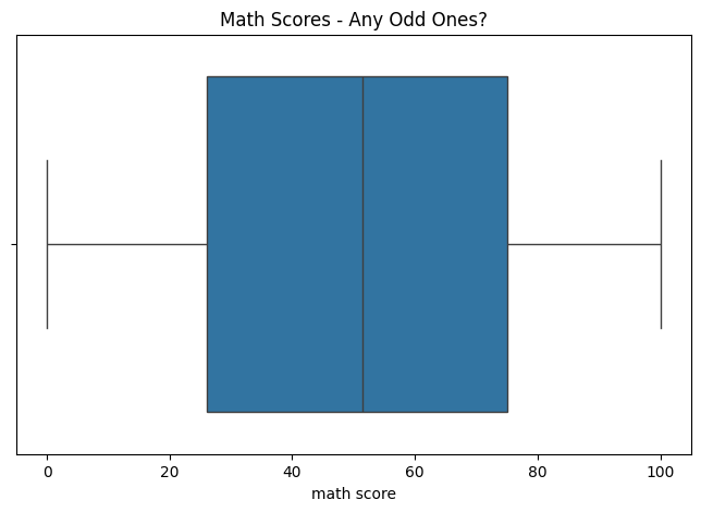
What I See:
Most scores are between 50 and 80, but there’s a dot way down at 0. Is that a mistake? Maybe not — someone could’ve bombed the test. If I wanted to remove it, I’d try this:
# Find the "normal" range
Q1 = data['math score'].quantile(0.25)
Q3 = data['math score'].quantile(0.75)
IQR = Q3 - Q1
data_clean = data[(data['math score'] >= Q1 - 1.5 * IQR) & (data['math score'] <= Q3 + 1.5 * IQR)]
print("Size after cleaning:", data_clean.shape)<= Q3 + 1.5 * IQR)]
But I’ll keep it — it feels real.
Step 4: Look at Skewness
Skewness is when data leans one way — like more low scores than high ones. I check it for math score:
from scipy.stats import skew
print("Skewness (Math Score):", skew(data['math score']))

# Draw a picture
sns.histplot(data['math score'], bins=10, kde=True)
plt.title('How Math Scores Spread')
plt.show()
Skewness (Math Score): -0.033889641841880695
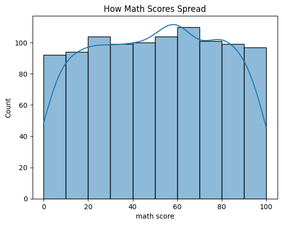
What I See:
Skewness is -0.3 — slightly more low scores, but not a big deal. The chart shows most scores between 60 and 80. If it were super skewed (like 2.0), I’d tweak it with something like np.log1p(data[‘math score’]). Here, it’s okay.
Step 5: Turn Words into Numbers (Encoding)
Computers don’t get words like “male” or “female” — they need numbers. I fix gender :
Install scikit-learn
%pip install scikit-learnfrom sklearn.preprocessing import LabelEncoder
le = LabelEncoder()
data['gender_num'] = le.fit_transform(data['gender'])
print("Gender as Numbers:")
print(data[['gender', 'gender_num']].head())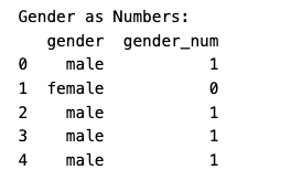
What I See:
female turns into 0, male into 1. Easy! For something with more options, like lunch (standard or free/reduced), I’d split it into two columns:
data = pd.get_dummies(data, columns=['lunch'], prefix='lunch')Now I’ve got lunch_standard and lunch_free/reduced — perfect for later.
Step 6: Scale Numbers
Scores go from 0 to 100, but what if I add something tiny like “hours studied”? I scale to keep it fair:
- Normalization (0 to 1):
from sklearn.preprocessing import MinMaxScaler
scaler = MinMaxScaler()
data['math_score_norm'] = scaler.fit_transform(data[['math score']])
print("Math Score (0 to 1):")
print(data['math_score_norm'].head())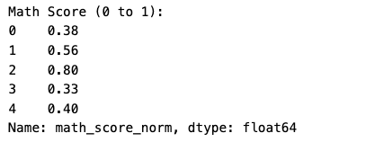
Standardization (center at 0):
from sklearn.preprocessing import StandardScaler
scaler = StandardScaler()
data['math_score_std'] = scaler.fit_transform(data[['math score']])
print("Math Score (Standard):")
print(data['math_score_std'].head())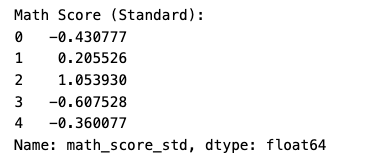
What I See:
Normalization makes scores 0 to 1 (e.g., 72 becomes 0.72). Standardization shifts them around 0 (e.g., 72 becomes 0.39). I’d use standardization for most models — it’s my go-to.
Step 7: Make New Features
Sometimes I mix things up to get more out of the data. I create an average_score :
data['average_score'] = (data['math score'] + data['reading score'] + data['writing score']) / 3
print("Average Score:")
print(data['average_score'].head())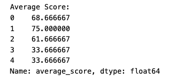
What I See:
A kid with 72, 72, and 74 gets 72.67. It’s a quick way to see overall performance — pretty useful !
Step 8: Find Connections
Now I look for patterns. First, a heatmap for scores:
correlation = data[['math score', 'reading score', 'writing score']].corr()
plt.figure(figsize=(8, 6))
sns.heatmap(correlation, annot=True, cmap='coolwarm')
plt.title('How Scores Connect')
plt.show()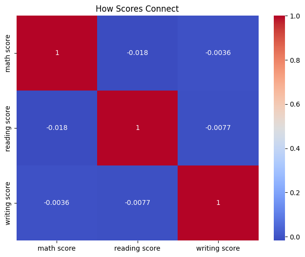
What I See:
Numbers like 0.8 and 0.95 — scores move together. If you’re good at math, you’re likely good at reading.
Then, a scatter plot :
plt.figure(figsize=(8, 6))
sns.scatterplot(x='math score', y='reading score', hue='lunch_standard', data=data)
plt.title('Math vs. Reading by Lunch')
plt.show()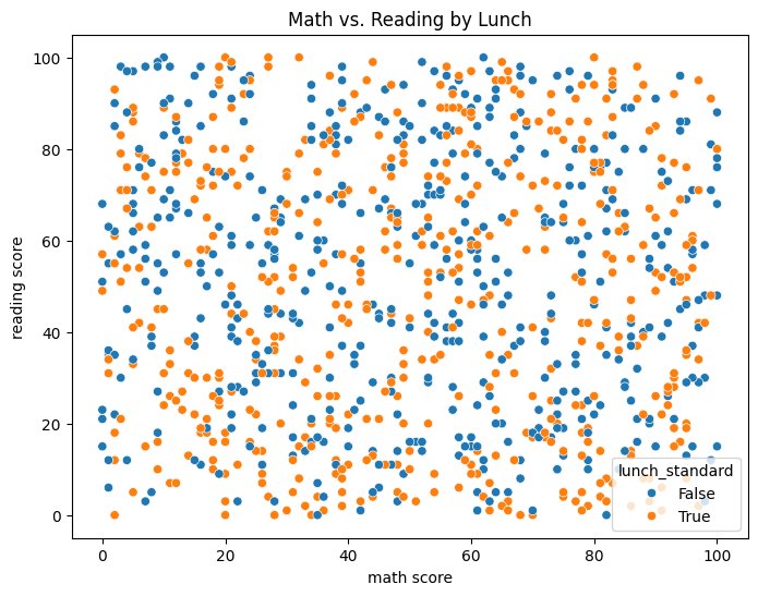
What I See:
Kids with standard lunch (orange dots) score higher — maybe they’re eating better?
Finally, a box plot:
plt.figure(figsize=(8, 6))
sns.boxplot(x='test preparation course', y='math score', data=data)
plt.title('Math Scores with Test Prep')
plt.show()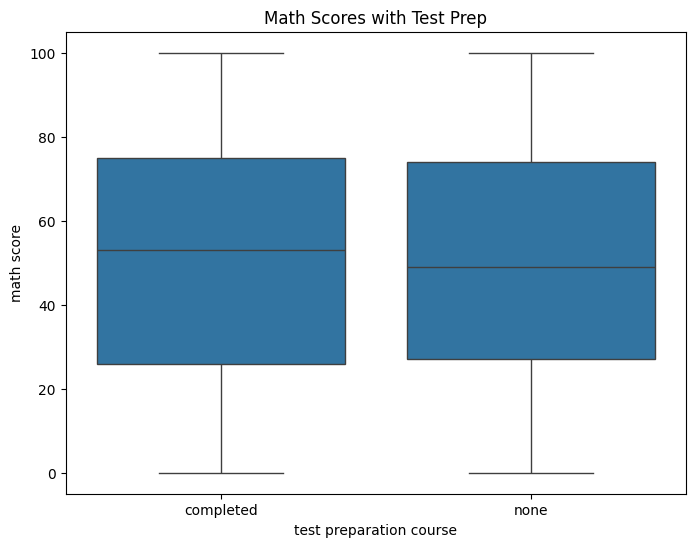
What I See:
Test prep kids have higher scores — practice helps!
What I Learned
Here’s the scoop:
- Basics: 1,000 students, 8 columns, no gaps.
- Outliers: A few low scores, but they fit.
- Skewness: A little off, but no biggie.
- Patterns: Lunch and test prep boost scores.
It’s like a mini-story about how little things affect school performance.
What’s Next?
This EDA sets me up for more:
- Guess Scores: Could I predict scores with lunch or test prep?
- Model Prep: Use my encoded gender for machine learning.
- New Ideas: Play with average_score some more.
- Cool Stuff: Group kids or predict who passes.
I’ll dive into these on www.codeswithpankaj.com—check it out !